
Picture yourself wandering through a poster session during a pre-COVID-19 scientific conference. The hall has hundreds of posters, many with jargon-filled titles that you don’t quite understand. On some of the posters, the text describing the background, the methods and the research findings is so small that the only thing you can read while strolling by is the title.
You’d planned to spend an hour wandering around the session and learning about new, exciting research. However, because it’s difficult to tell which posters are of interest from the titles, you step closer to one to read about the findings. The enthusiastic graduate student standing by the poster immediately begins talking to you about the project, and without a polite way to bow out of the conversation, you end up talking to the student for 30 minutes and leave the session feeling unsatisfied.
This frustrating scenario has happened to me multiple times at scientific conferences. But about a year ago, I heard about “better posters” from a video shared by my adviser. This new poster design claims to improve the scientific conference experience and allow better transfer of knowledge, and I decided to try it out at the annual American Society of Human Genetics (ASHG) conference.
In the past, the way I made my posters was somewhat crude. I’d obtain one of my lab mates’ previous posters, modify the title and background information, fill the rest of the poster with methods, figures and discussion, then spend hours playing around with font sizes and wording to make sure everything fit nicely into the poster margins.
The creator of the new format, Mike Morrison, provides a handy template to use. I can confidently say that it took substantially less time to make a good-looking new-format poster. But what would my fellow conference attendees think?
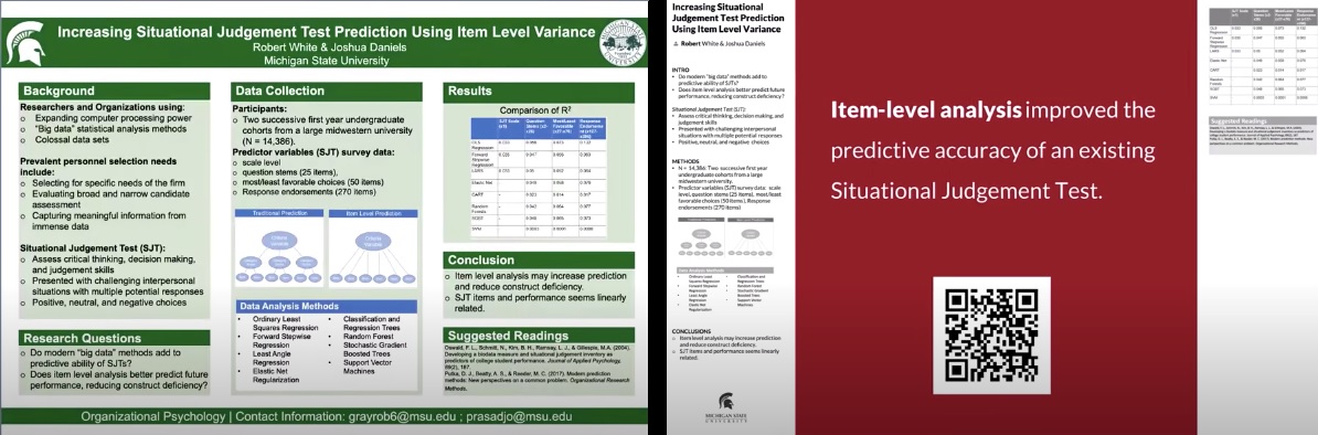
At the ASHG conference, several people complimented me on the simplicity of the design, but others mentioned that they felt that the new format didn’t convey as much information as it could have. However, I felt that more people liked the format than those who did not. Walking around the halls, about one in 10 posters seemed to have adopted the new format. I liked the new format more, since it is much easier for casual passersby to understand what the poster is about without investing too much time. Additionally, for those who want to learn more, the QR codes on the new posters link to papers, which contain more detailed methods and figures.
Overall, I had a great experience using the “better poster” format and plan to continue using it for future poster sessions. If you have used or seen the new poster format, what are your thoughts on the design?
Related content
- Tips and Tricks for Virtual Conferences
- So You Want to Attend an Academic Conference…
- Re-thinking Language as a Scientific Tool
Want to read more from the Johns Hopkins School of Medicine? Subscribe to the Biomedical Odyssey blog and receive new posts directly in your inbox.